
SQL Injection Explained
Learn how SQL Injection works with real examples and a hands-on demo using PHP and MySQL. Explore a GitHub repo with vulnerable code to safely test and understand this critical web vulnerability.
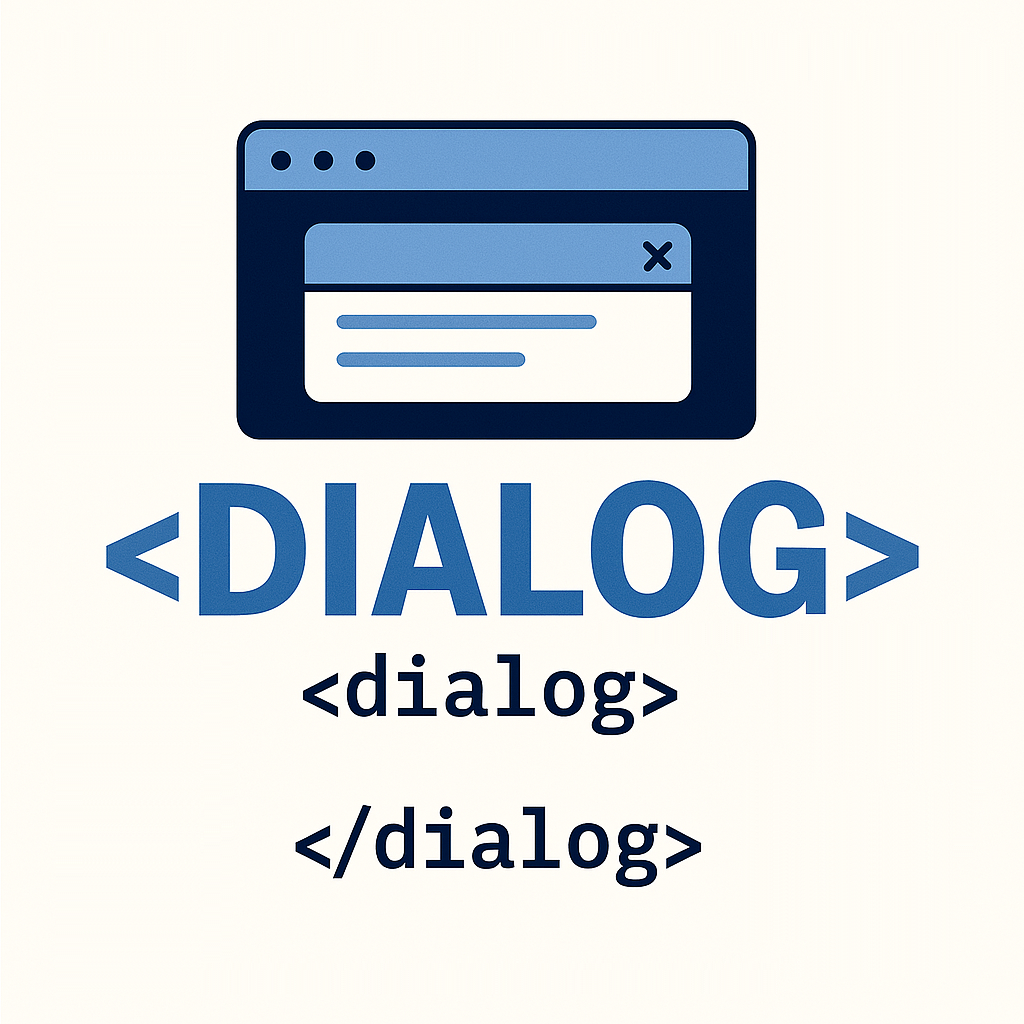
Learn how to use the native HTML element to build accessible, lightweight modals without third-party libraries. Covers usage, styling, accessibility, benefits, and practical examples.
Table of contents [Show]
Dialogs are an integral part of any user interface, be it the web, mobile, or any other that exists today.
Whenever you need any confirmation from the user? You just show the user a dialog with some selectable options. Whenever you want to gather some input from the user? You again present a dialog box with submittable form input.
You can use dialogs by installing JavaScript libraries in your project, and those are available in any kind of framework you are using. Third-party libraries are great, but they do come with an additional overhead to your project that not only adds a certain amount of complexity but also increases the overall bundle size of your app.
On top of this, you are going to install the entire library and yet you are only going to use a certain features of that library. This is not a great in my opinion.
That's where the browser's native <dialog> element comes into play. It's everything you will ever want in a dialog. <dialog> is an underutilized feature of the html. Introduced in HTML5, this element provides a simple and effective way to create model dialogs, such as pop-ups or alerts. In this article, we will explore the <dialog> element in depth, covering its purposes, attributes, and practical examples.
<dialog> is an HTML element that represents a dialog box such as alert, confirmation, inspector, or subwindow. It is a part of HTML5 specification, specifically designed for creating modal dialogs. A model dialog is a secondary window that captures user focus, demanding a response before allowing interaction with the main application. Common use cases for <dialog> elements include:
User Forms: Prompting users to input data, such as login or registration forms.
Alerts and Confirmation: Displaying messages, warnings, or confirmations.
Custom UI Elements: Creating custom dialog boxes for various interactions, like settings or help menus.
A very basic <dialog> element would look like so:
<dialog>
It's Dialog this sid.
</dialog>
since the <dialog> would not be visible by default, we would need to pass in an open property to make it visible:
<dialog open>
It's Dialog this sid.
</dialog>
The <dialog> element provides two key methods for controlling its visibility and behavior:
Here’s an example of how to use these methods in practice:
<dialog id="myDialog">
 <p>This is a native HTML dialog.</p>
 <button onclick="document.getElementById('myDialog').close()">Close</button>
</dialog>
<button onclick="document.getElementById('myDialog').showModal()">Open Dialog</button>
This will create a simple model dialog that opens when the button is clicked and closes when the "Close” button is pressed.
| Attribute | Description |
|---|---|
open | A boolean attribute that indicates whether the dialog is open. You can set this directly in HTML or use JavaScript methods. |
returnValue | A string that can be set when closing the dialog to know how it was closed. |
const dialog = document.getElementById('myDialog');
dialog.addEventListener('close', () => {
 console.log(dialog.returnValue); // e.g., "submitted"
});
<dialog id="myDialog">
 <form method="dialog">
   <p>Do you agree?</p>
   <button value="yes">Yes</button>
   <button value="no">No</button>
 </form>
</dialog>
Styling the <dialog> Element
The <dialog> element can be styled using CSS like any block-level element:
dialog {
 border: none;
 border-radius: 8px;
 box-shadow: 0 0 10px rgba(0, 0, 0, 0.3);
 padding: 1.5rem;
 width: 300px;
}
You can even animate the appearance with transitions or keyframes:
dialog::backdrop {
 background: rgba(0, 0, 0, 0.4);
}To make <dialog> accessible:
Practical Example – Confirmation Dialog
<dialog id="confirmDialog">
<form method="dialog">
<p>Are you sure you want to delete this item?</p>
<menu>
<button value="cancel">Cancel</button>
<button value="confirm">Delete</button>
</menu>
</form>
</dialog>
<button onclick="openConfirm()">Delete Item</button>
<script>
function openConfirm() {
const dialog = document.getElementById('confirmDialog');
dialog.showModal();
dialog.addEventListener('close', () => {
if (dialog.returnValue === 'confirm') {
alert('Item deleted!');
}
}, { once: true });
}
</script>
References
Why you should be using the dialog element - LogRocket Blog
Implementing modal popup with native html <dialog> element (sudshekhar.com)